Having used NetWorker since 1996, it’s fair to say that while I’ve watched a lot of features and interfaces in NetWorker get visible changes, the one that hasn’t has typically been nsrwatch. Sure, it’s had the backend connectivity updates, and updates to allow it to understand what it’s needed to, but superficially it’s been pretty much exactly the same from my first usage of NetWorker with a 4.x server right through to 7.6 SP1.
That’s changed in 7.6 SP2. OK, first the downside: it’s still not available on Windows. Now, the upside: you can turn on/off display sections, providing more space for those sections you leave showing, and you can scroll in each section, too. It also has had a general facelift in terms of how the displays look.
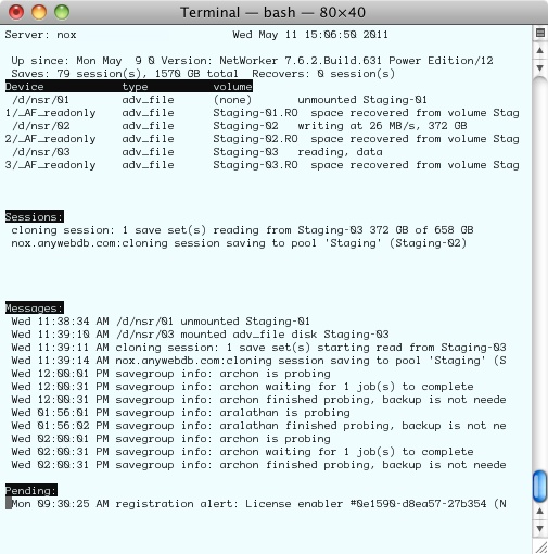
For instance, this afternoon I grabbed screenshots of a lab server using first a NetWorker 7.6 SP1 client:
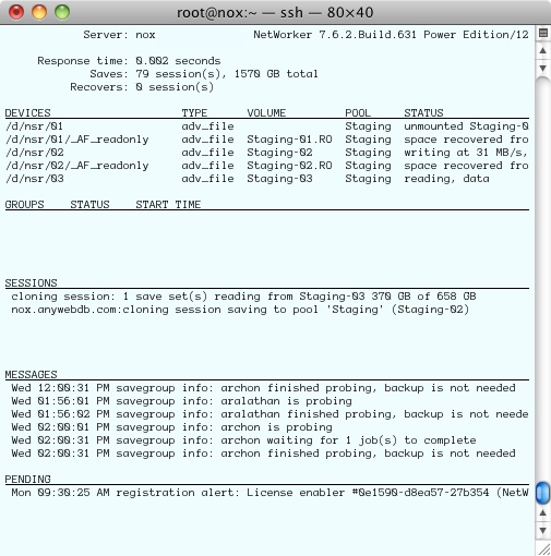
 Next, we have the same server shown via a 7.6 SP2 nsrwatch:
I think this layout is certainly cleaner than the 7.6 SP1 and lower nsrwatch – but as I said, it also has advantages of being able to toggle each of those panels off or on, using:
- d – Devices
- g – Groups
- s – Sessions
- m – Messages
- p – Pending
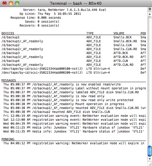
For instance, having toggled off groups and sessions in a server with a large number of devices, I could see considerably more:
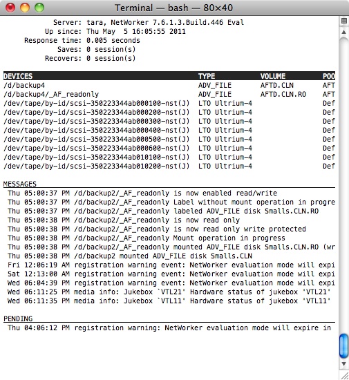
Additionally – you can scroll – use tab in nsrwatch to jump between sections, and then arrow keys to scroll up and down. For instance, here’s a screen shot of the devices section partially scrolled through:
These may seem like minor changes, but to people who live on the command line, they’re very welcome.


This is also in 7.5.4 FYI
With NetWorker 7.6.2 Build 631 it works on Windows too!!!
Unbelievable
I can confirm also that NW7.6.2 nsrwatch works on Windows.
I happen to not like the new ‘nsrwatch’, so I recovered the old one and use it instead.
Just found, that nsrwatch for Windows comes with nw7.5.4.4 Build 643.