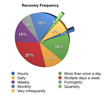
Thanks to everyone who provided responses into the recovery survey. It proved to be a very interesting insight into some of the recovery profiles businesses experience. It confirmed some generally held views about recovery, but it also highlighted some differences. For example, consider the results for recovery frequencies:
The full report, in PDF format, is available from the reports section of the NetWorker Hub.

You might want to use colors that are more different, next time. The two yellows and blues are almost indistinguishable.
Thanks, I hope you found it useful.
I did. The whole blog is quite useful. Waiting for more articles on Networker 8 🙂