In User Experience, a dark pattern refers to a UX workflow that effectively urges the user to either perform an action, or accept a condition they would not have wished to.
Dark patterns aren’t exclusive to what we think of as software UX. For instance, back in my system integrator days, when I wrote and ran training courses, I quickly came to the conclusion that exam questions featuring double-negatives were appallingly unfair to people for whom English was not their first language. (Once I realised this, I started doing whatever I could to stamp out the use of double-negatives in the quizzes we wrote for our training courses, and lo and behold, the quiz results started to equalise.)
I’ve mentioned before that one of the side-effects of moving into a product management role that has such a heavy emphasis on UX is that I start to look at everything I use from that perspective. This leads to questions like:
- Who at Miele thought it would be a good idea to have a washing machine beep every 20 seconds for 10 minutes after a load finishes?
- Who at LG thought it would be a good idea to have a microwave do a little satisfied chirpy trill every 30 seconds after it finishes cooking until the end of time, or the user opens the door, whichever comes first?
- Who at Russell Hobbes thought a kettle with 6 different temperature setting buttons would be optimised by having the different temperature settings marked with removable ink that disappears the first time you wipe it down?
Much as these are annoying, they’re not dark patterns. The first two are nagUX (i.e., UX that is optimised to nag you) and the third is just a low quality build problem.
Dark patterns are worse than that.
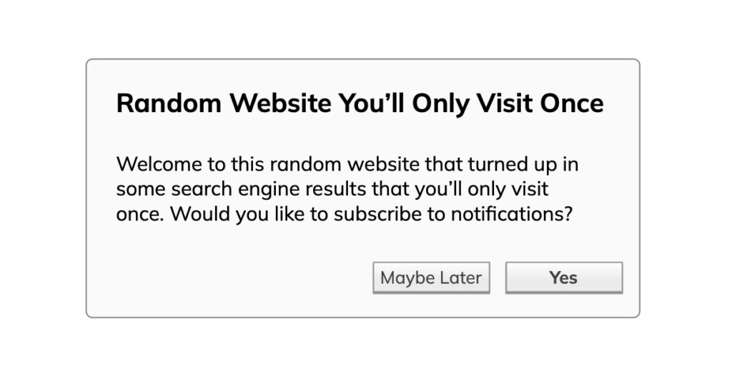
I’ll give you an example of the dark pattern that currently fills me with rage every time I see it: FauxNo.
FauxNo appears in software and websites, and works like this:

For me, FauxNo is one of the more regularly used dark patterns, and it’s also one of the creepiest. I’m sorry, but FauxNo tells me that the decision makers in your team are not listening to diverse voices. They’re not listening to marginalised people and they’re certainly not listening to women. The UX is smacks of an unwanted advance at a bar, or door knockers who take “No” as “Well I’ll come back later to see if you’ve changed your mind”. To me this is an outright gaslighting of your user. “I don’t believe in no so the best you’ve got is to delay the inevitable” is not – ever – a way to ingratiate yourself to your user base.
This sort of behaviour is manifesting in too many places. What might have once been the province of slightly dodgy websites is now so ingrained in common UX practices in some companies that we’re now seeing it embedded in operating systems.
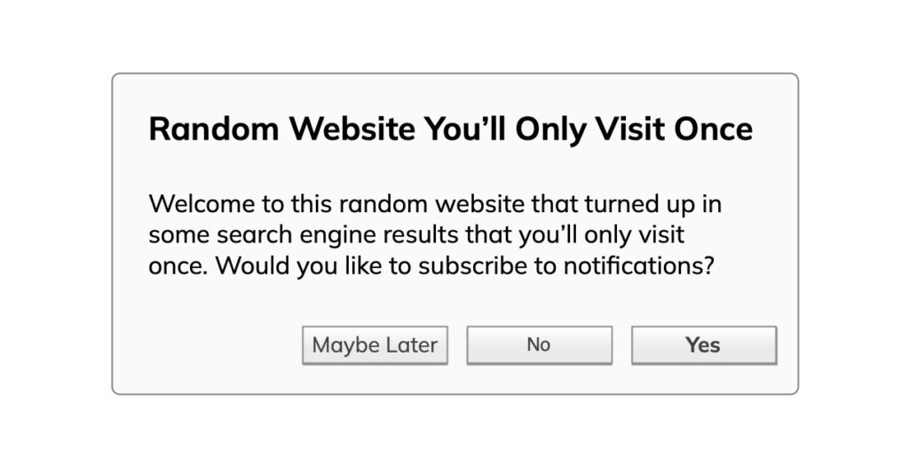
It’s not even as if it’s difficult to fix the problem:

Even if the user answers no, you can still check and see if they want other options. Let’s say the user answers “No”, you could still mention to them how they might enable the option later if they wanted to. Hell, you could even make one final (polite) stab at it:

But what happens if the user answers No?
That’s easy. No means no. I’m not joking. No. Means. No.
And that’s why this particular dark pattern of not giving the user an option to say No is outright creepy.
