Recent Tech
Bone Conduction Headphones
There’s a lot said for noise-cancelling headphones, but I have an ongoing gripe with most conventional headphones. Ear-bud headphones are uncomfortable for me – and I can never modulate my voice properly when speaking with them in. Over ear/can headphones are great in winter and suck in summer – but all year round they get more and more uncomfortable if you’ve got glasses on underneath them (and I always have glasses on). Regular in-ear headphones (the non-bud variety) are getting few and far between, and are more often than not the hallmark these days of poor audio fidelity – and disturbingly likely to fall out at the slightest touch.
For years I’d been keeping an eye on the bone conduction headphone market – where the headphones press up against the bones in front of your ear, and your ears are completely uncovered – but each time I looked into it, it seemed the audio fidelity was still considered lacklustre. More recently that seems to have turned a corner though.

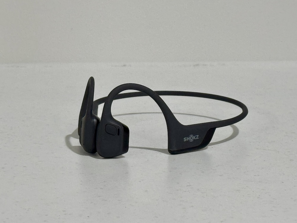
So recently I decided to try out some bone conduction headphones – in this case, the Shokz OpenRun Pro 2, and I’ve got to say, I’m a fan. Yes, 100%, I’ll say that they do not offer the same richness of sound as full over-ear noise-cancelling headphones like Beats or Bose, but they’re good audio and they’re non-intrusive. To be honest, I love going for a walk with them on going I can hear traffic, people, dogs, etc., and so there’s far less chance of being surprised by something. And as someone who has constantly found almost any form of headphone or earphone uncomfortable in some form or another for the past decade, these are joyously comfortable to wear.
They’re not spatial audio, but they do have a weird sensation of making it feel like you’re listening to music via speakers because it’s not going directly into your ear. When I tried one in store I immediately hit stop because I thought the music was coming out of a speaker and not the headphones. And funnily enough, my husband had the exact same reaction when he tried them on, too.
It’s audio witchcraft, and I absolutely love it.
eInk in a Phone (sized) Form Factor
I do love a good eInk device, but I need more interaction than a book reader. Several years back I bought a Boox Air, and that was useful, but it wasn’t great. More recently I bought a reMarkable (annoyingly, about a month before the more recent Pro came out), and I definitely find that quite useful for note taking and free-form ideation.
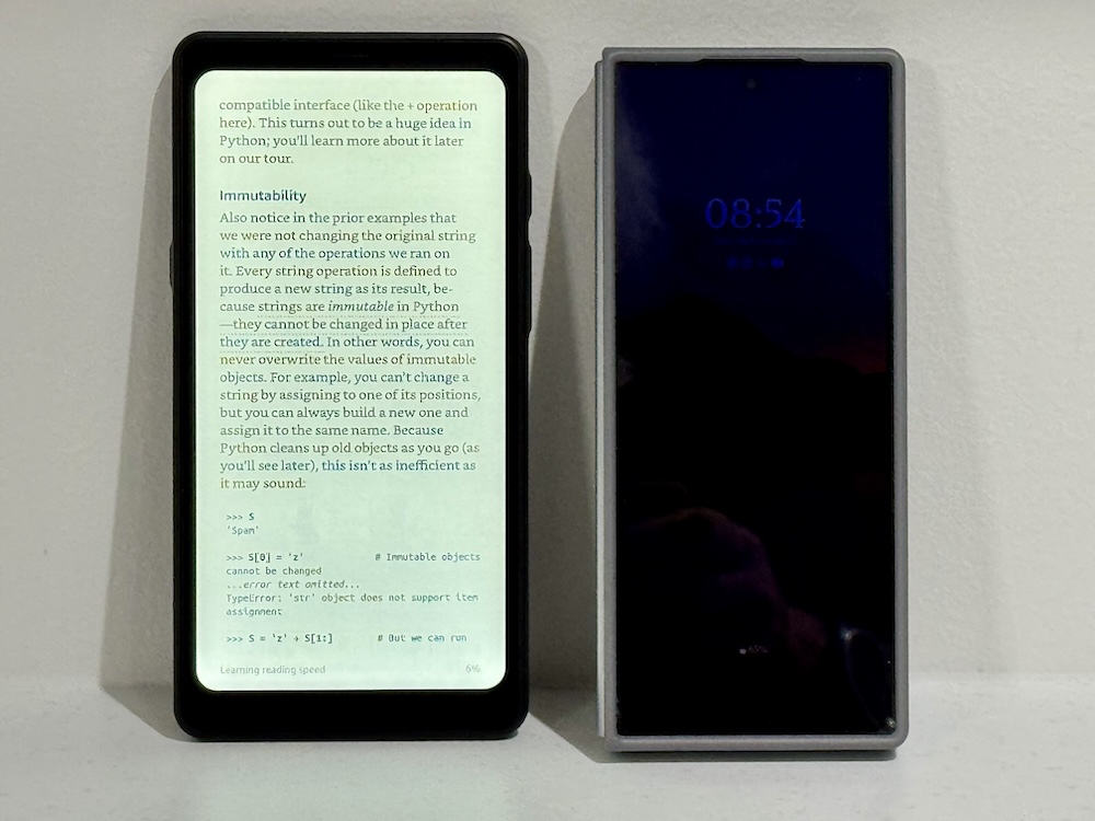
But my most recent foray into this territory has been the Boox Palma, a phone-sized eInk device that (like most of the Boox range) is a fully fledged Android tablet – just in a small form factor.

(And yes, typically, I managed to buy the Palma about two weeks before Boox released the Palma 2, but I’m not feeling too annoyed given I was able to trade in some gift vouchers for it.)
I’ve only had this for a week, but I’m already enjoying it. Reading the news (e.g., Guardian) on it is a relatively soothing experience (if you ignore anything to do with the Orange Chaos Turkey) – like a return to newspaper, but without the newspaper ink hayfever reaction. And since it’s phone sized, it’s a lot less space-intrusive than a regular newspaper.
It’s also great for supplemental TODO tracking. I maintain my daily TODOs in paper notebooks rather than in an application because writing it out helps my memory, and with aphantasia I don’t visualise my tasks if I’m not looking at them, so I need a constant reminder. As soon as an application is closed, I lose track of what I’m meant to do. Having a small form factor tracker that stays visible even when it’s turned off is a huge boon for additional organisation, all the time.
The recent trend towards colour eInk displays is exciting, and I’m sure in a few years time when it becomes more prevalent explore that path as well, but for the moment I’m impressed with the Palma.
The case for careful iconography in interfaces
Recently I read this fascinating piece from Eric Bailey, Don’t forget to localize your icons, and it reminded me of the challenges that are introduced by profligate use of icons within interfaces.
There are three distinct challenges I see:
- Subjective interpretations of the icons
- Disrupting consistency
- Accessibility
Subjectivity
Eric quite rightly makes the case that not everyone will see icons from the same contextual background; a thumbs up gesture (and therefore icon) may seem innocuous enough to a number of western cultures, but he notes it can be considered an insulting gesture in places like Bangladesh, Iran, Iraq, Afghanistan and other regions. Issues can also arise from symbology being subverted over time – one of the more recent examples of that is the OK symbol/emoji being appropriated by the white supremacy movement as some secret gesture of solidarity.
The question really comes down to how reliably you can say that an icon you’re using can be objectively understood or whether it requires a subjective interpretation. One of the most well-known examples of this comes from the problem of nuclear waste. This is material that will remain hazardous to life for thousands of years to come (and let’s be honest, the chances of our civilisation lasting that long aren’t looking high at the moment). So how do you mark something as being so hazardous to life that it might be understood after a complete breakdown of knowledge?
Disrupting Consistency
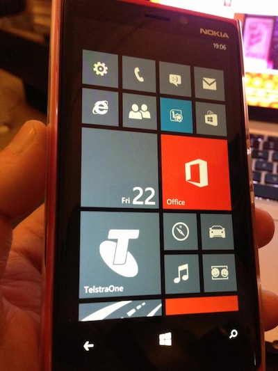
The generally subjective nature of iconography means you should naturally err on the side of minimalism when including them in interfaces. Sure, there are some interfaces (e.g., launchers on smart phones and tablets) where icons are an essential part of the interface, but even there icons have to at least follow relatively standardised design guidelines. Even in these interfaces though, if you standardise too much, you risk ruining the user experience by so drastically reducing diversity in visual design. The Microsoft Phone experience as exemplified by the Nokia Lumia series was a perfect example of this:
I used a Lumia 920 for close to six months and while the hardware was superb, the interface absolutely destroyed it. The uniformity introduced by the tiles plus the “infinite scroll” nature of the launcher page meant that unless an application was at the very top or the very bottom of the interface, it was hard to find – to the point of being lost.
I mention this uniformity problem because that’s often seen as as the potential solution (assuming it’s even allowed) in other interfaces in response to another iconography problem.
For instance, your product interacts with dozens of different vendor products: Microsoft SQL Server, VMware, Oracle, AIX, Windows, RedHat Enterprise Linux, SUSE Linux, and so on. Each of these have their own unique and reasonably identifiable icons. Why can’t you use their icons on screen to make it easier for people to identify what they should be hunting for? Well, there are three distinct problems to this:
- Legal and marketing issues – are you permitted by the owner of the icon to use it within your interface?
- Design rules – assuming you are permitted to use it, that icon has its own usage rules. Even if it doesn’t (let’s pick on a generic Linux Penguin logo form), it has its own design ethos which may not match the design ethos of everything else you use on the page.
- Conformity – let’s say you can (a) use the icon and (b) tweak the design (e.g., render it in the same palette as the rest of your interface); at that point you are starting to – or have completely lost – the messaging you actually wanted to convey.
So you either can’t use it, or you can use it at the risk of making your entire interface look like an inconsistent pigs breakfast through warring palettes and designs, or you can use it and force the icon(s) to fit your design palettes so much that you lose the original intent and purpose of the icon.
It’s a lose/lose/lose situation.
Accessibility
The final consideration for minimising icons in interfaces is that of accessibility. Sure, you can make the argument that if every icon has appropriate alt-text associated with it, you’re meeting accessibility guidelines. But, there’s making the interface accessible, and there’s making the interface comfortably accessible. A screen reader will read out the alt-text for graphics that are used on the page, but this will introduce lumpy differences in the read-out of the screen. Of course, there are times this can’t be avoided – you might need to include a graph on the screen to help convey some information and of course this graph should be generated with alt-text as well. But, that’s where you get again into the evaluation of essential vs non-essential. The graph is likely something that is essential, whereas an icon is probably more going to fall into the non-essential category – useful, but there are other ways of achieving the same information flow. And so, from an accessibility point of view, keeping icon usage to a minimum is also useful.

