Over at TED, there’s a short yet highly interesting look at data visualisation technology called the AlloSphere.
I’m a big fan of data visualisation – I think there’s currently too much emphasis on data search. As the amount of storage we continue to consume grows though, data search will only get you so far. To use an analogy, how helpful is a search so refined that it allows you to find a needle in a haystack if you have 500,000 haystacks in front of you?
We are already at the cusp of search being insufficient. Personal storage is a perfect example of this. On my desktop machine I currently have approximately 10TB of formatted storage presented, with about 70% utilisation. Yes, I’m not the average user, but I may be slightly representative of where the average user will be in about 3 years (I’m not unique – I think this would be the case for a lot of people in either IT or multimedia industries).
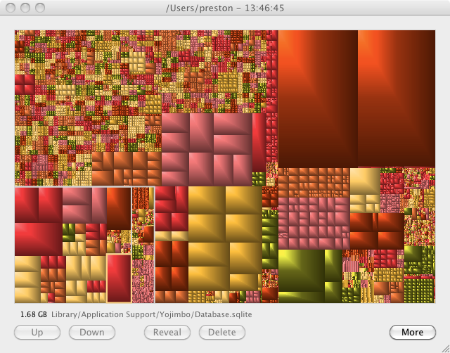
As much as Apple’s Spotlight is fantastic, sometimes it’s not enough. Sometimes it’s not about knowing what you’re searching for, but drilling down what you’re searching for. For example, I use a fantastic little app on the Mac called Grand Perspective to be able to visualise storage layout/use either on entire drives or individual trees of folders. I don’t use this all the time – and not always for search, but sometimes it’s more useful than any search tool I can think of – e.g., when I need to quickly see what is using space in a folder structure, or when I’m looking for a particularly large file I was working with recently but can’t recall what it was. Here’s a screen shot of Grand Perspective run against my home directory:

As you can see, it’s big chunks of colour all over the place. What information does it give me? It lets me quickly see where space is occupied. Spotlight doesn’t do this; Finder doesn’t do this – nor do the counterpart features of Windows. I can just move the mouse cursor over any block and instantly see what file it maps to – instantly giving me comparative size details.
Data visualisation: get used to the term – I predict you’ll be hearing it with increasing regularity in the coming years.
(Bringing this back to NetWorker (or even EMC, more generically), I’d love to think there’s serious R&D being done on working out how to integrate data visualisation techniques in their products. In NetWorker we’ve sort of started to get the most primitive versions of this in the dynamic reports in NMC, but that should be seen as only the most absolute starting point. The next phase is to have the developers talk to experts in the field so they get an appreciation of how they might represent data in a way that allows faster “deep diving”.)
GrandPerspective – very interesting utility indeed. It looks like a clone of Windows utility SequoiaView created in 2002.
http://w3.win.tue.nl/nl/onderzoek/onderzoek_informatica/visualization/sequoiaview/
Hi – thanks for pointing that out. I had been aware of some other (similarish) utilities for the Mac and assumed something similar would be available for Windows – it would certainly appear that Grand Perspective is based reasonably heavily on SequoiaView. Data visualisation is not something which is specific to any individual OS, so it’s good to see similar tools available on other platforms too.
You might also want to check out Windirstat (http://windirstat.info/), which is also available as a portable version. It was inspired by KdirStat (http://kdirstat.sourceforge.net/).
Cheers
Thanks for pointing that out – I’d encourage anyone to check out such visualisation tools for their operating system of choice (I’m betting there’s something available for Linux and/or other Unix platforms as well).
linux people might want to check out filelight or baobab (kde/gnome)
Filelight has reliably answered the question “where’d all my disk space go?”
Thanks for pointing these options out. It would appear that filelight can be sourced from http://www.methylblue.com/filelight/ and Baobab can be sourced from http://www.marzocca.net/linux/baobab/ – for anyone interested.