Note: I originally wrote this in 2012, on my ‘unsane.info’ blog. I’m winding that blog down, but wanted to preserve this post.
Introduction
When I first joined BHP IT Newcastle in 1996, I recall one of the senior managers there mentioning a recent TV interview he’d done for the local station. As I recall it, the interview was about some new investments being made by BHP IT in Newcastle, and the journalist at the time wanted to do the interview in the computer room, standing in front of a bank of computers.
The “bank of computers” they picked was actually the primary network rack. Why? Because they had the most blinking lights.
The early years – The unfathomable future
The original “Alien” movie (1979) was a pivotal example of how we envisaged early computer interfaces. I’m not talking about the displays, mind you; while they’re incredibly primitive, they’re a symptom of the time and they can be accepted as having a certain kitsch nostalgia:
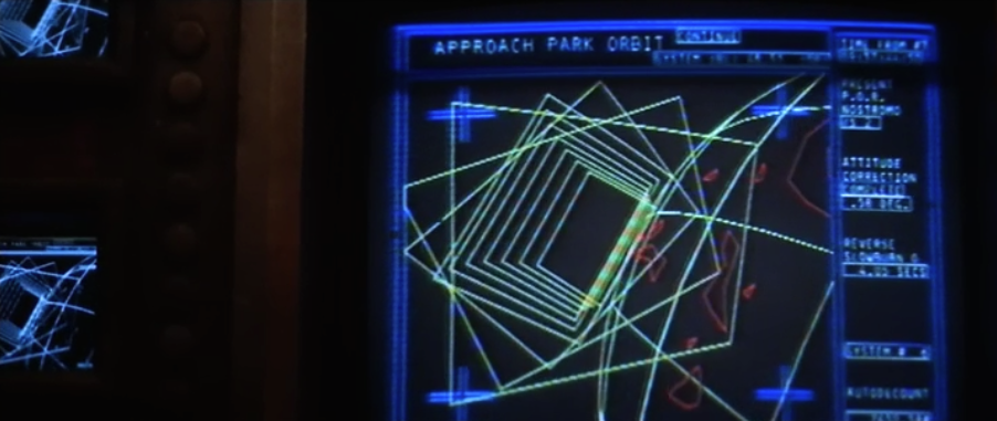
Enduring 8-bit graphics and primitive vector graphics are a necessity when you watch a movie of this age, and you just learn to deal with them.
What’s most noticeable though is how computers were presented. Let’s look at few stills from “Alien”, as an example:
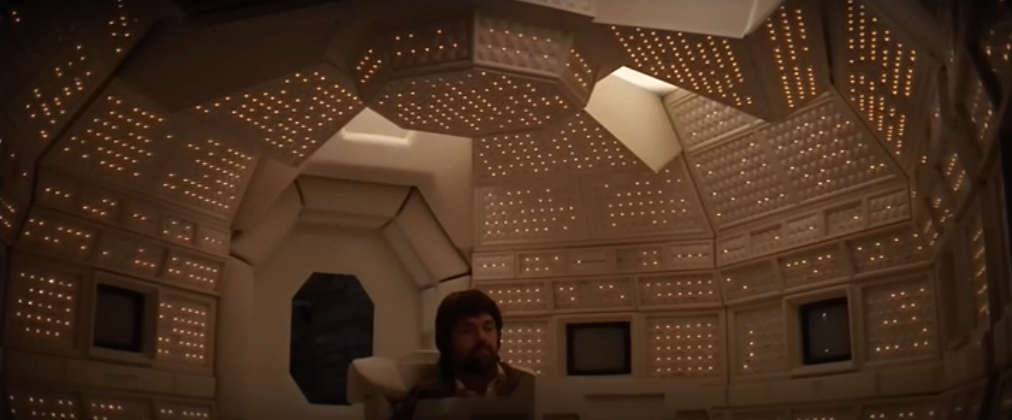
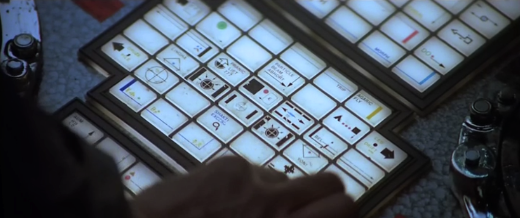
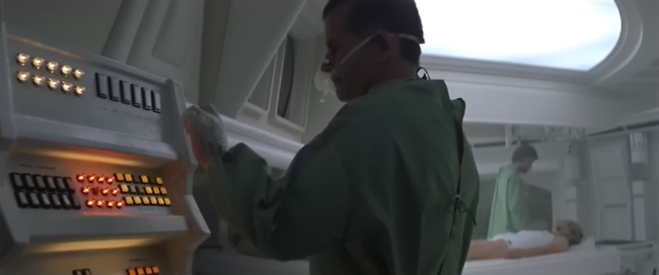
These images represent a lot about how computers – even futuristic ones – were imagined. In particular, common themes were:
- Lots of blinking lights. (The “mother” room above with Tom Skerritt is perhaps one of the absolute best examples of this.)
- Lots of buttons. Rows and rows and rows of buttons.
- The vast majority of buttons had no visible labels on them whatsoever.
“Alien” was released in 1979, and it was indicative of the attitude towards computers from that era. For comparison, consider “Star Trek: The Motion Picture”, released in December 1979:
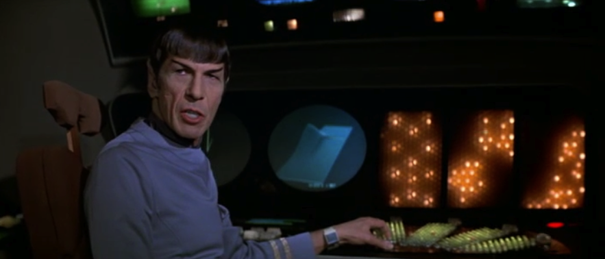
- Lots of flashing lights – check.
- Lots of buttons – check.
- Buttons without labels – check.
Even if we go back to 1968, when “The Ultimate Computer”, an episode of the original series of Star Trek was first aired, we see that overall, there were a lot of similarities between how computers were represented:
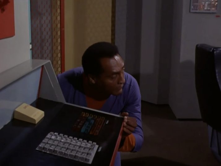
Buttons, so many buttons.
Going back further, alien technology got different glowing lights and different physical interfaces, but they still had knobs and – and in the case of The Forbidden Planet, synaptic interfaces:
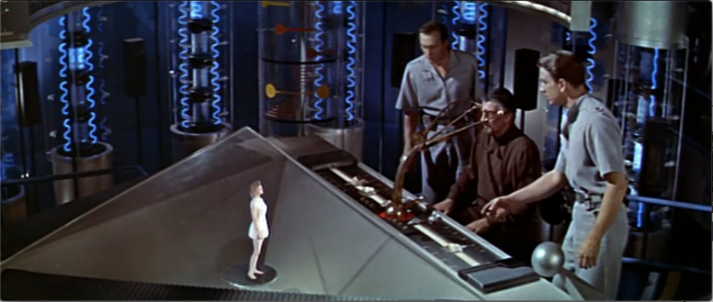
Credit where credit is due though: for such an early movie, The Forbidden Planet was particularly futuristic in its imagining of advanced technology. Perhaps as much as anything, because it didn’t rely on CRT screens, it was able to portray a different style of interfacing to technology.
Jumping forward to 1984 when Doctor Who, “Resurrection of the Daleks” was first broadcast, we see a console in the TARDIS that looks like the following:
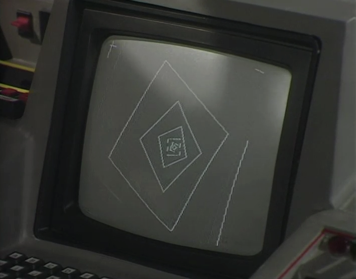
Again, don’t get focused on the graphics on-screen, but check out the interface – a keyboard (and an ABCDEF… rather than QWERTY style layout, to boot).
Jumping back to “2001”, released in 1968, the presentation of computers even then was focused on buttons and flashing lights (with the exception that HAL of course was AI and had a full speech interface):
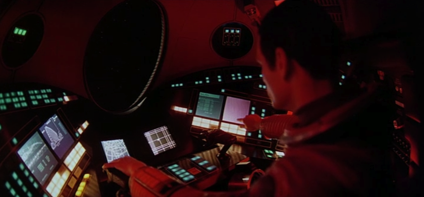
Bearing in mind at this stage – anywhere between 1968 and 1984 – computers were devices that were barely understood by lay people; in 1968 in particular, one of the founding computers of the “new digital age”, the IBM S/360, had only been out for four years. People were, quite frankly, only just barely starting to get their minds around what even these primitive (by our current standards) systems could do. For many years, a “computer” had been a person employed to crunch numbers, not some electronic device.
By 1984, while there were 8-bit desktop computers (Commodore, Apple II series, etc.), the burgeoning industry was really only just starting to strap the training wheels on; Apple’s pivotal 1984 ad (January 22, 1984) to introduce the Macintosh didn’t actually feature the computer itself, and interfaces in terms of what the average person might be aware of were well and truly mired in the keyboards and the flashing lights. Computers were still often seen as the domain of men, and computer users were still closer to mechanics than consumers.
The Changing Face
Eventually though, something significant started to happen with the representation of computers on-screen. This change profoundly demonstrated the evolving attitude of people towards these previously enigmatic devices.
1987 represented a good turning point in the way computer interfaces were shown on screen, with the start of “Star Trek: The Next Generation”. This introduced a touch-screen interface used throughout the series, LCARS (Library Computer Access/Retrieval System) which had no hardware buttons at all:
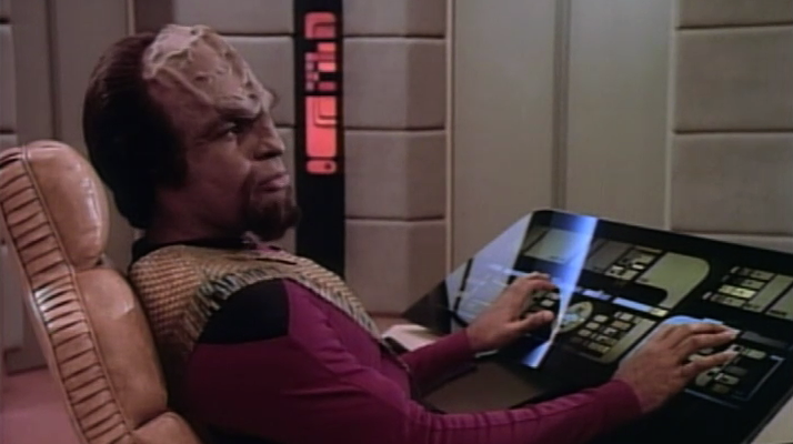
Since these interface boards were completely workshop developed, the most they featured on screen in terms of human interaction were blinking lights and changing light levels in response to touch. It would be easy to imagine though that the specific purpose of such a touch-screen interface would have been to allow the interface to be redesigned/represented on the fly based on the operational function being performed at the time.
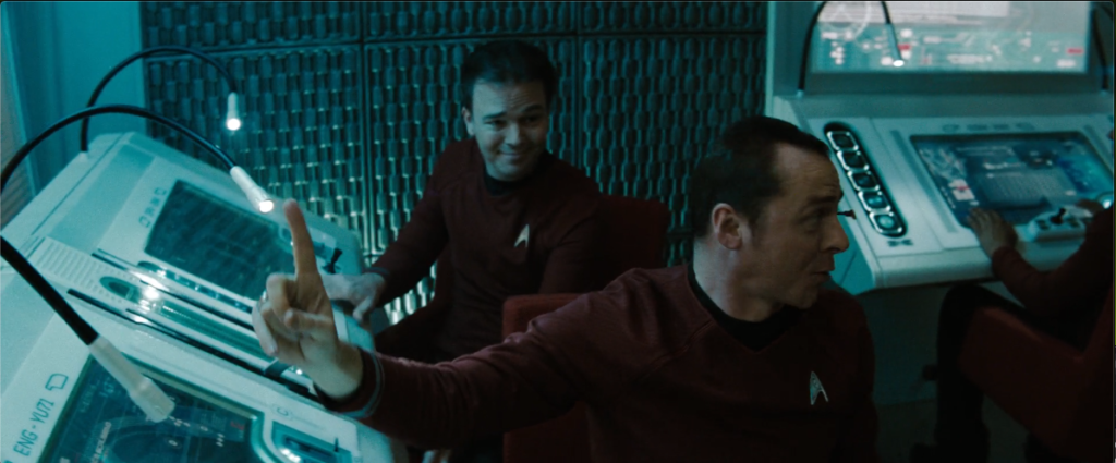
Indeed, “Star Trek”, the reboot in 2009, showed us full touch screen interfaces that clearly simply showed whatever the interface needed – no hard-coded interfaces, for the most part:
Jump to 2002, with the release of “Minority Report” (a populist B grade movie), and you had the presentation of an alternate to a touch interface – a gestural augmented reality/projected interface:
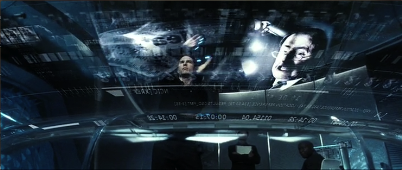
This style of interface had the user wear gloves that allowed motion tracking and interaction with the interface to the point that gestures could be used to slide content around, bring it in and out of focus, etc. While futuristic, and predictive of interfaces being developed along the Kinect product line, it did always seem an awful lot of hard work, as exemplified by the exasperated and overly theatrical gestures used in the German science fiction spoof, “Dreamship Surprise” (2004):

While it’s difficult to portray in a single image, the Queen becomes increasingly frustrated with the continual flicking of the zoom-out operation.
“Quantum of Solace” (2008) kicked things up a gear by presenting a fully touch-screen multi-user interactive desk:
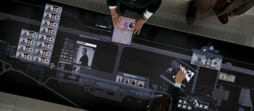
Here, users could swivel objects around, zoom and expand them, slide them across the desk to other users, etc.
“Avatar” (2009) went further on the interface front, having users move apps and processes from a main monitor/computer onto a portable tablet (something for which no screen shot does justice); ironically since starting to use the Mac app “Teleport” some years ago, and other multi-PC spanning keyboard-mouse software, I’ve frequently found myself trying to drag windows/applications between computers; quite simply, what Avatar shows isn’t really all that futuristic, but rather, inevitable.
So what happened?
What happened between the movies and TVs of the older era (mid-80s and older) and those of the newer era?
The shift was profound yet entirely subtle, something that a lot of people wouldn’t have really noticed at all – we shifted from portraying computer hardware to portraying computer software.
Think of it – Alien, 2001, Star Trek, Doctor Who, etc. – they were all focused on computers as big chunks of hardware that were physically manipulated; switches were pulled or flipped, buttons were toggled or hit, and there was a lot of non-intuitive feedback in the form of pulsating and blinking lights. A computer was an often substantially large piece of hardware that would be approached by the user on-screen as if they were approaching an altar, or entering a place of worship. The human was typically portrayed as intruding on the computer rather than using the computer.
None of which, of course, reflected where computers were actually heading.
At some point though, fiction and the future aligned, and the way in which computers were presented changed to being all about the interface – the software. This was of course just holding up a mirror to society in general: since computers have been around, their usage model has been undergoing a significantly powerful evolution from being a specific tool to being a general purpose piece of equipment; the logical continuance from a “piece of equipment” is an appliance, and that’s the era we’re starting to straddle into now, thanks in no small part to interfaces such as iOS and Android — when the software interface is done really well, the hardware practically melts away and you’re just using software.
The fact that we’re so comfortable with such depictions of computers in fiction now speaks volumes of how far our perception of computers have come – how mainstream they’ve become. (And, for that matter, how powerful they’ve become. Your average smart phone has more significantly processing power and RAM than your average computer from ten years ago.)
What I find particularly amusing about this shift in the portrayal of computers on screen is how there’s still some rigid holdouts in IT who haven’t yet got the picture. Because computers and computing devices are shifting towards appliances, the average consumers aren’t interested in the amount of RAM they’ve got, or the speed of the processor, so long as it works, just the same way that consumers don’t generally inquire as to the number of heating elements per bread slot in a toaster, etc. “Does it toast? Yes: good. Does it look aesthetically pleasing for my kitchen? Yes: good. Is it a suitable price for the function? Yes: good.” That’s the overall decision making process that goes into a toaster.
Movies and TV shows often tell us fantastical stories that have little to no grounding in reality; yet at some point they collectively started to demonstrate the shift that was being experienced in computing – the movement away from the specific hardware to the general and nigh on infinitely adaptable software. They started working on the basis that the hardware was almost completely irrelevant to the actions you performed on it, which was completely setup and controlled in the software.
And they did it without most of us even noticing it.
1 thought on “The Changing Face of Computers On Screen”