
One of the options introduced in Avamar 19.1 is the ‘Fitness Analyzer’. This is a great tool that lets you really drill into the health and activity of your Avamar data protection environment.
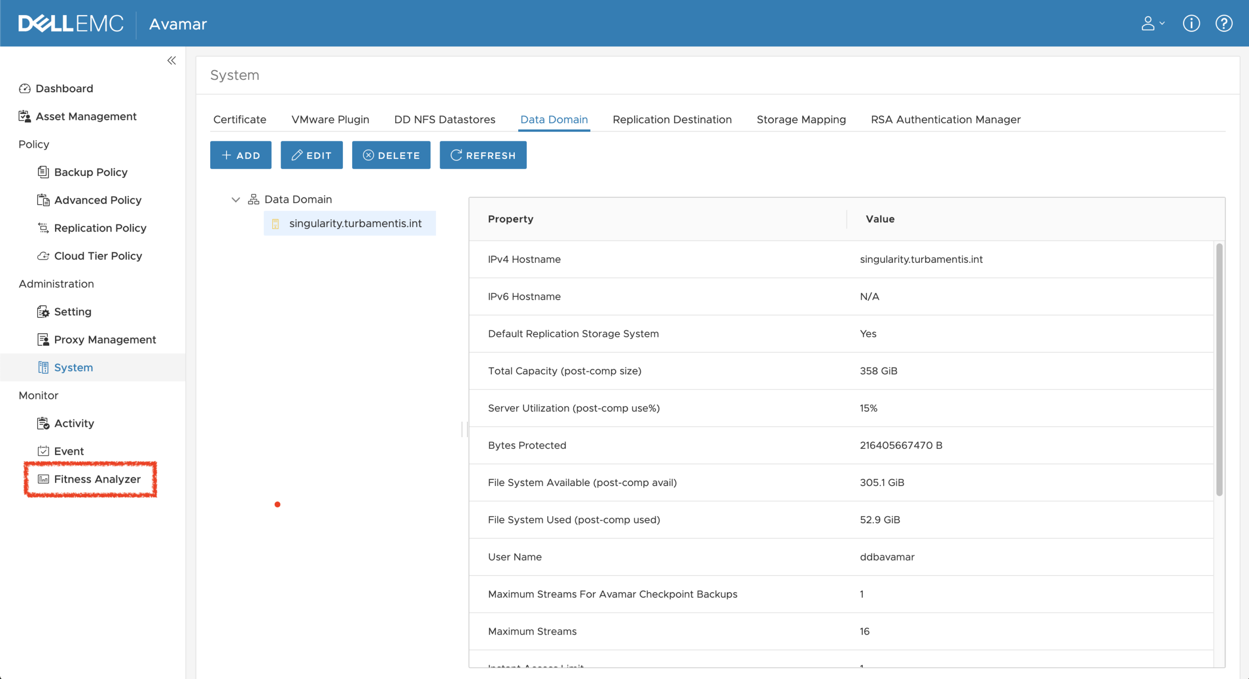
You’ll find the link to the Fitness Analyzer as the last option under ‘Monitor’ in the Avamar Web UI (AUI). Clicking the link will launch a new tab in your browser where you can drill into the operational statistics and results of your system.
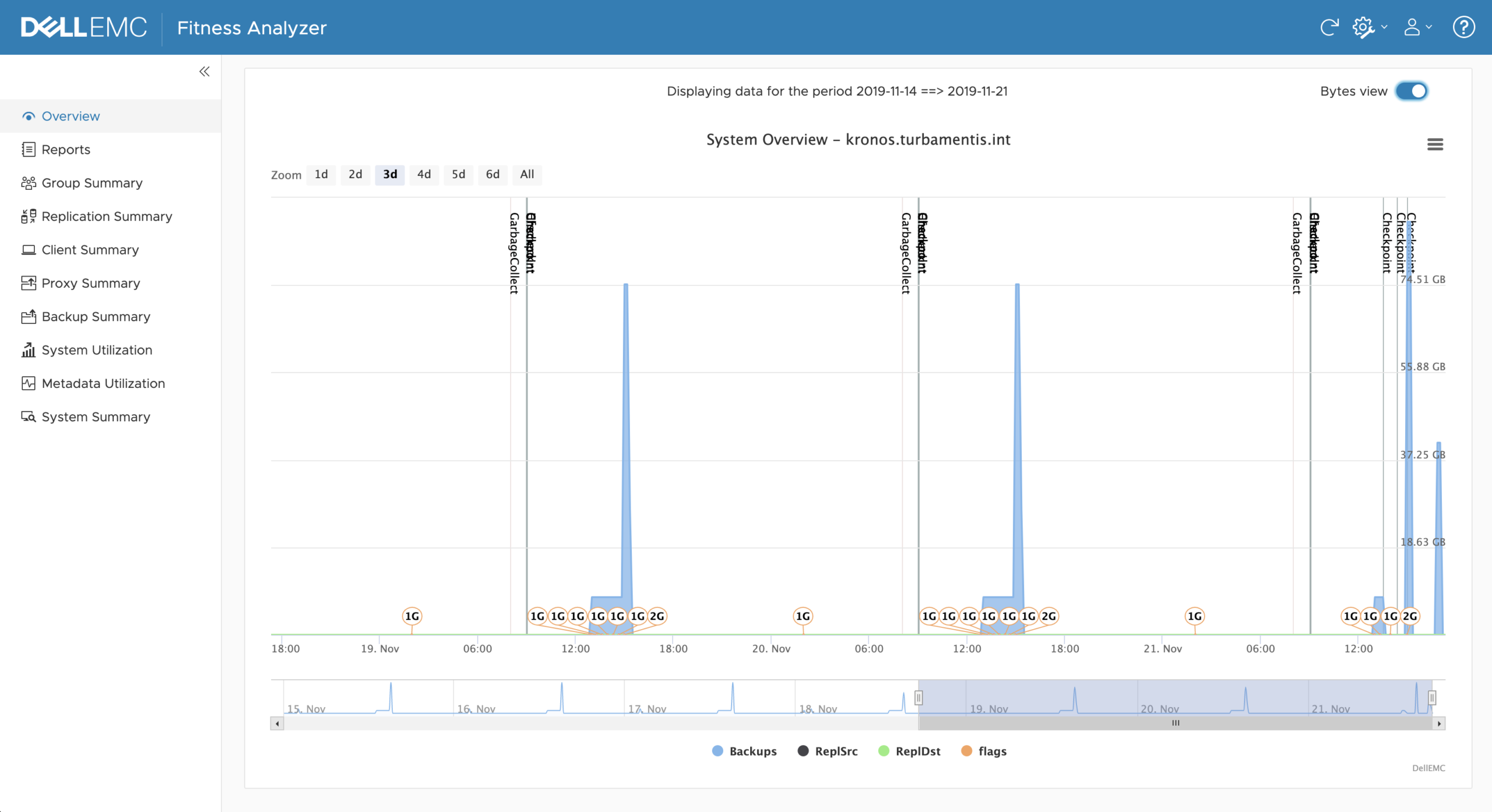
Fitness Analyzer opens with an ‘Overview’ tab that shows you a high-level view of activities within the system. This includes details like:
- Number of running backup jobs at any given time
- Number of groups running at any given time
- When checkpoints are run
- When garbage collections are run
You can choose between seeing the number of jobs (the default), or click the “Bytes view” to see the amount of data processed. I personally quite like the “Bytes view”, but both options are quite useful, so it’s great to be able to just flick between them.
The numbered bubbles in the screen-grab above (1G, 2G, etc.) show how many groups were running at any time. Better yet, hovering over a numbered bubble will show you how many clients were running within the groups.
The goodness doesn’t end there, though! If you hover over any point in time on the graph, you’ll get to see for that time:
- The number of backups running
- The number of backups waiting
- The number of replication source jobs running
- The number of replication source jobs waiting
- The number of replication destination jobs running
- The number of replication destination jobs waiting
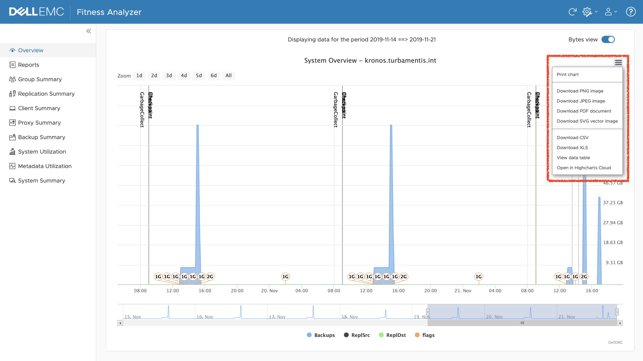
You can choose pretty much any time window you want up to 7 days. So you can zoom out to see a big-picture view to see if there’re odd patterns or zoom right in over a small window (say, a couple of hours), to see exactly what was going on at any time. If you need to save the graph, or the data, click the hamburger menu for a popup menu:
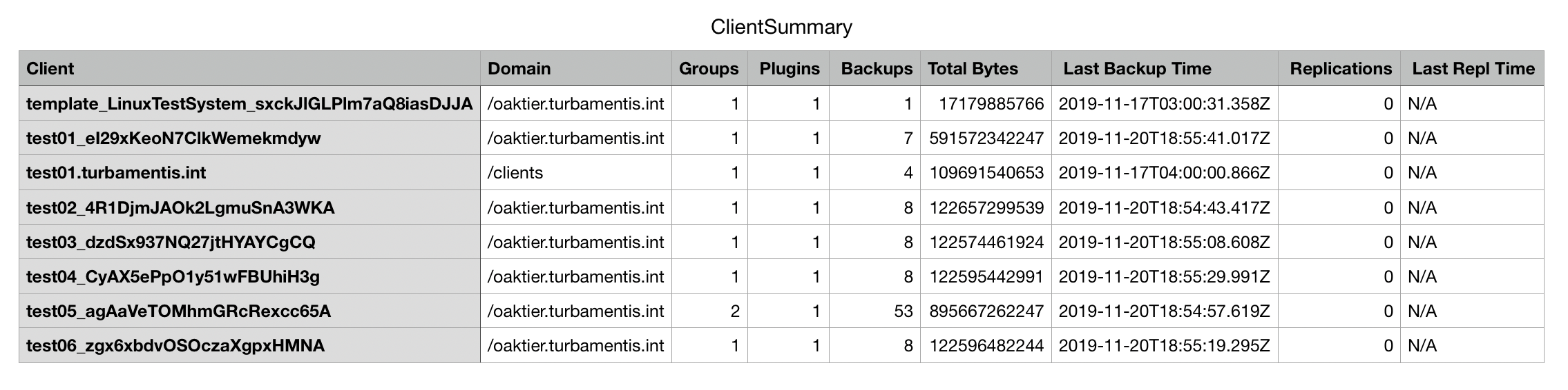
Jumping to the Client Summary Report now, you’ll get a view of clients protected over the last 7 days:
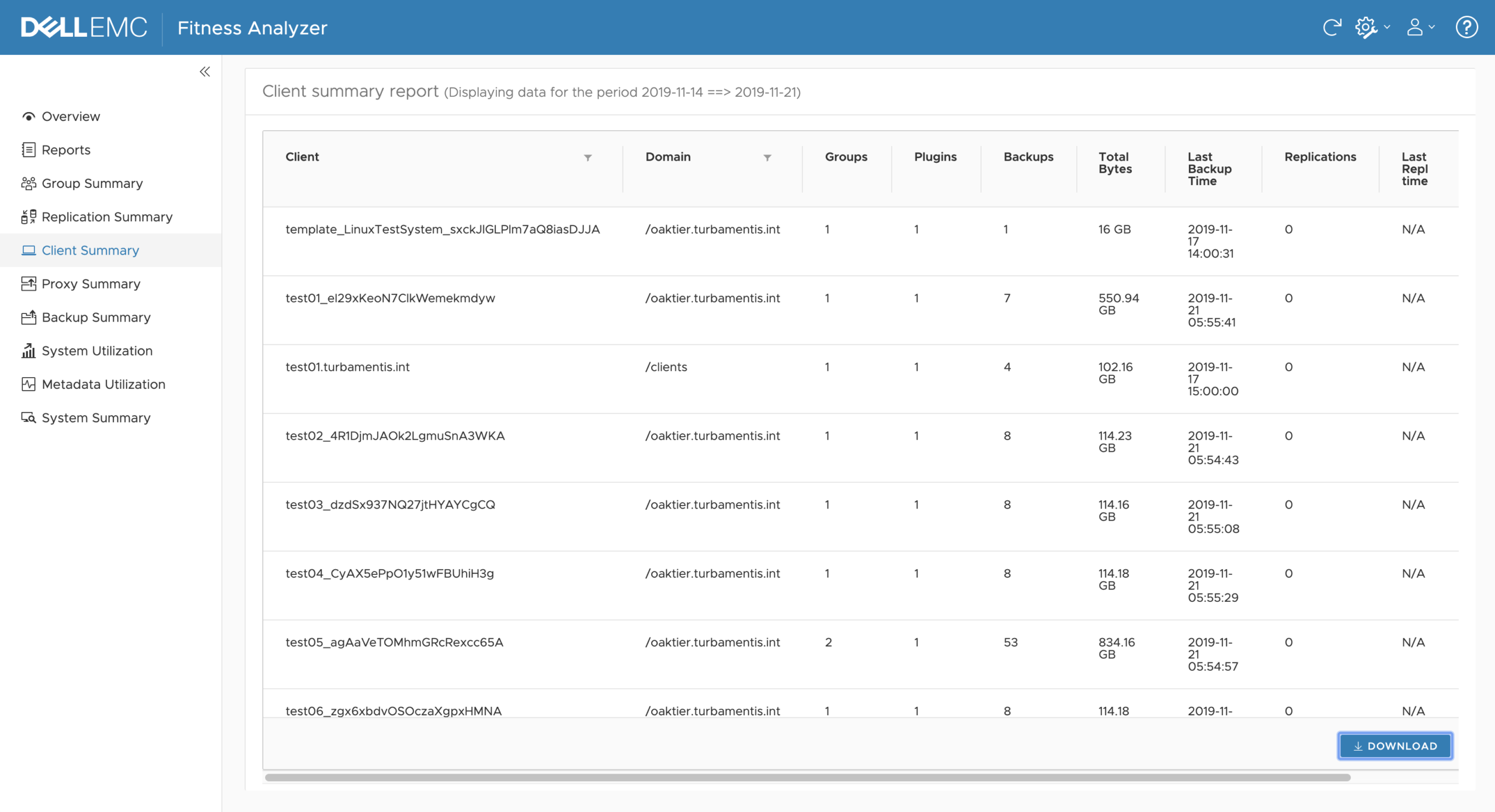
You can grab a CSV copy of the summary report by clicking the Download button. I opened the CSV in a spreadsheet app to get the following information:
There’s a wealth of information you can pull from the Reports tab, and for each report that you run, you can pull down a PDF or Excel copy:
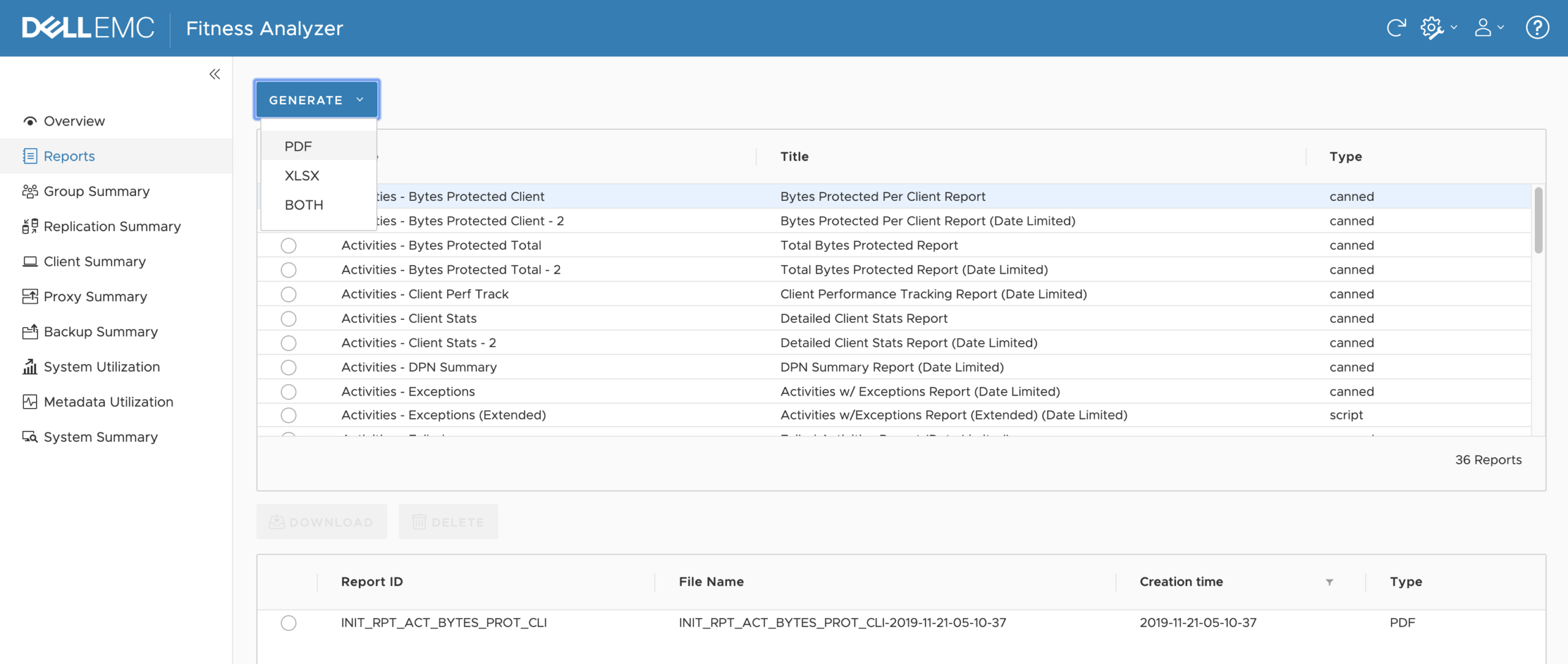
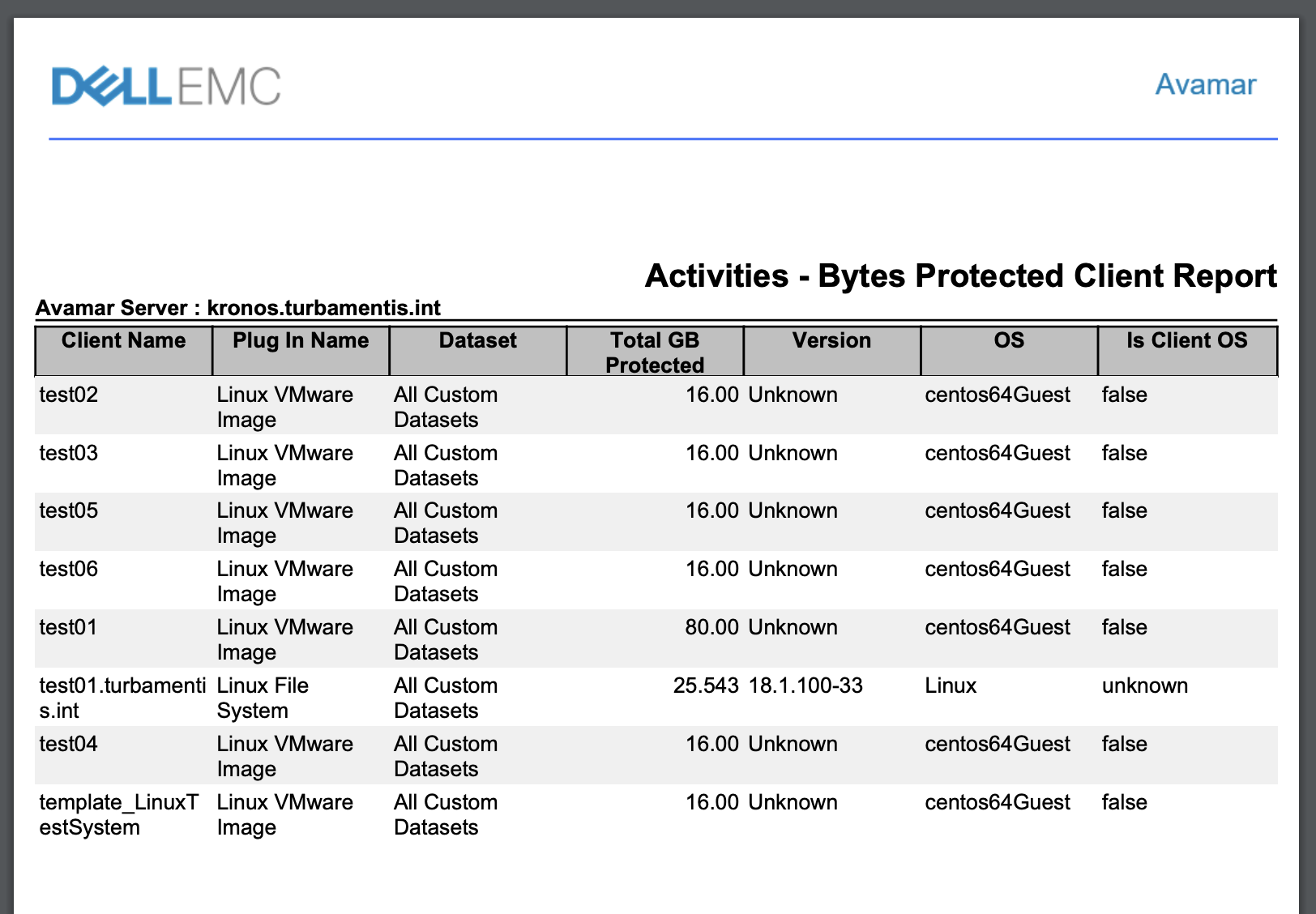
If you opt for the PDF report, you’ll get that opened in a new window – in this case, the bytes protected report looked like the following for me:
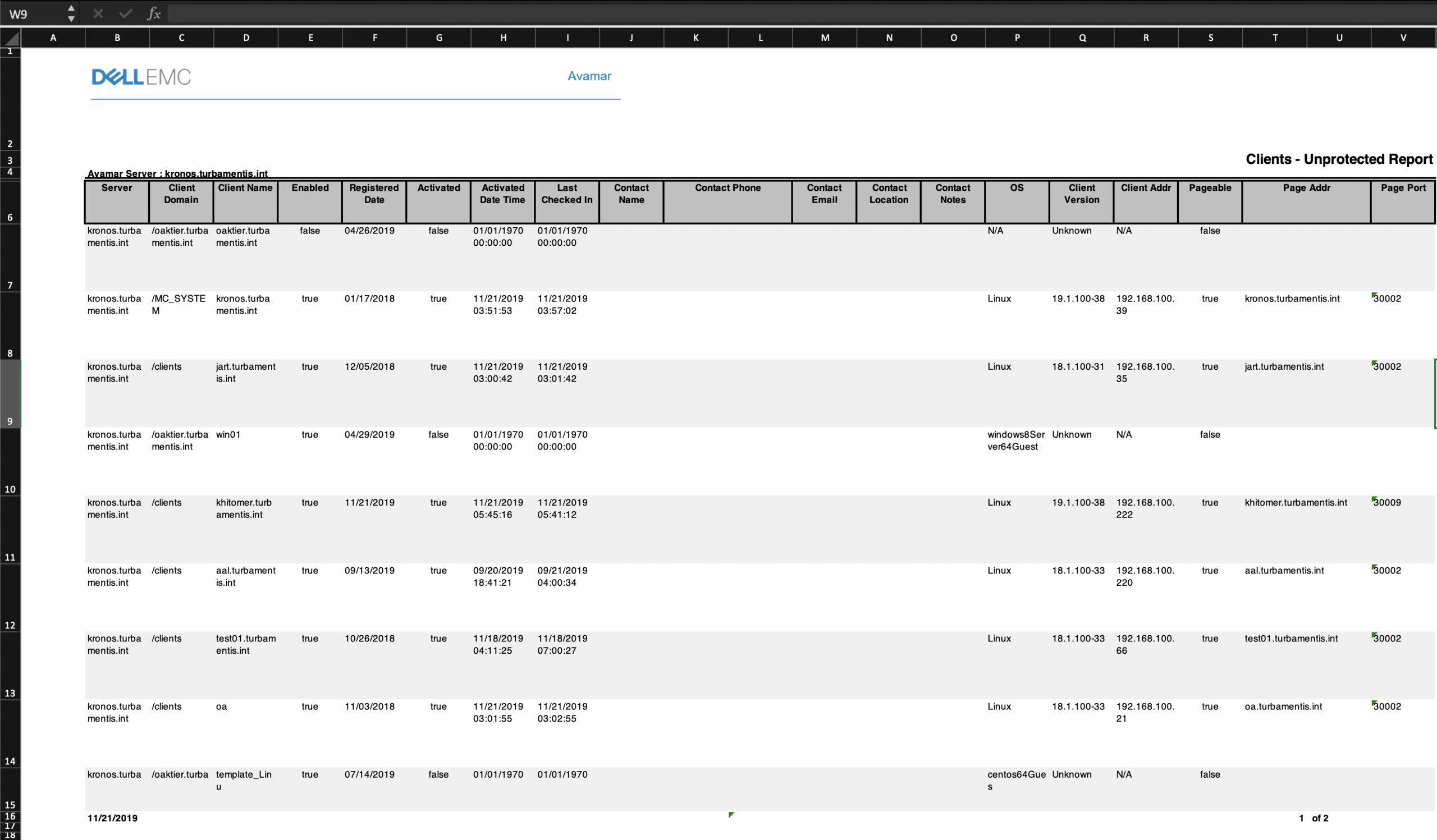
Opening in Excel, you’ll see the information in a format similar to the following:
Under System Utilization, you can pull out statistics and history about the performance of the Avamar system – regardless of whether it’s a single node server or a grid. For instance, here’s the CPU Utilization view:
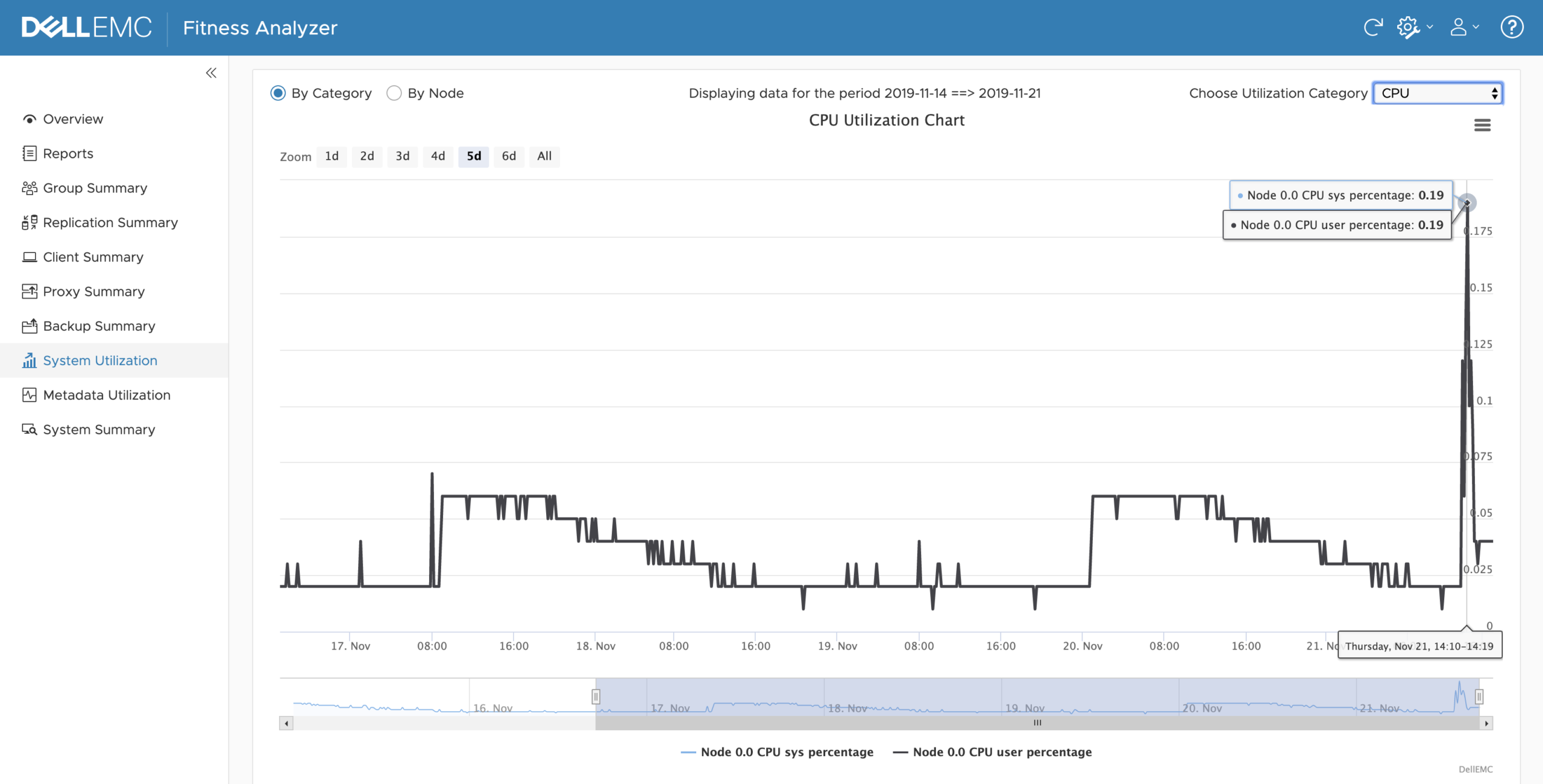
Clicking the hamburger menu in the top right-hand corner again lets you download graphs or data. Utilization categories are:
- CPU
- Network
- Disk read/write, and
- Disk utilization
Analyzer areas such as the Groups Summary, Proxy Summary (and I think Replication Summary – only I don’t have replication configured in my lab to check) give you tabular details over a week. By default, you’ll see a view of all groups that ran during the week, but you can expand any group to show all the details for that group for the week:
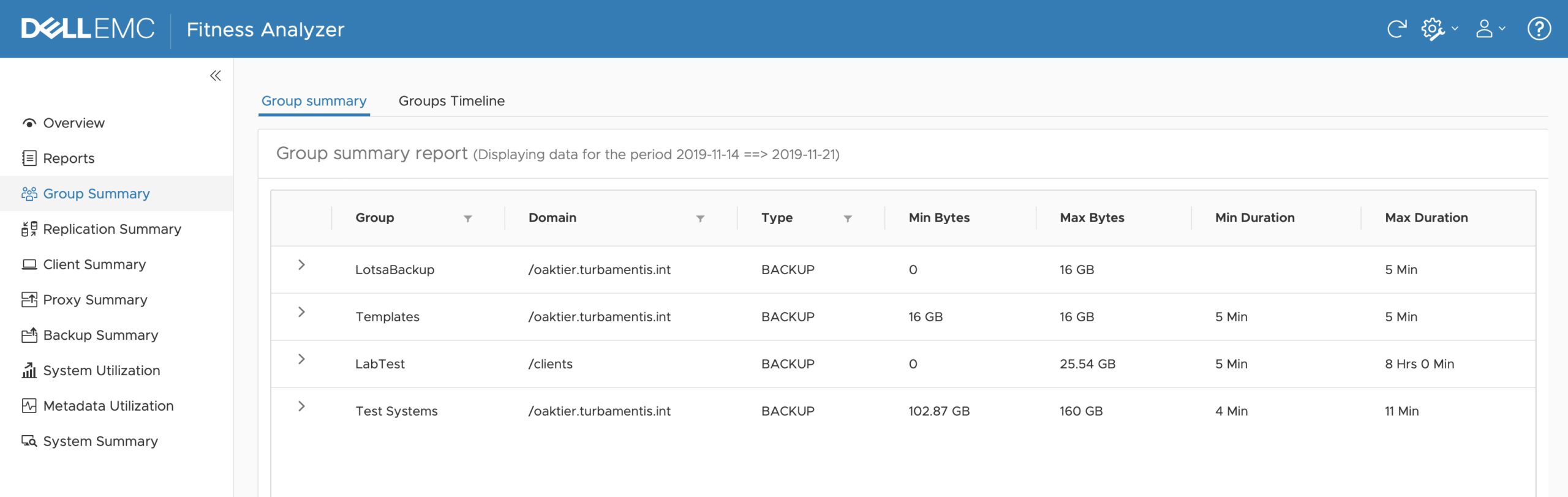
The expanded view showing each group execution looks like the following:
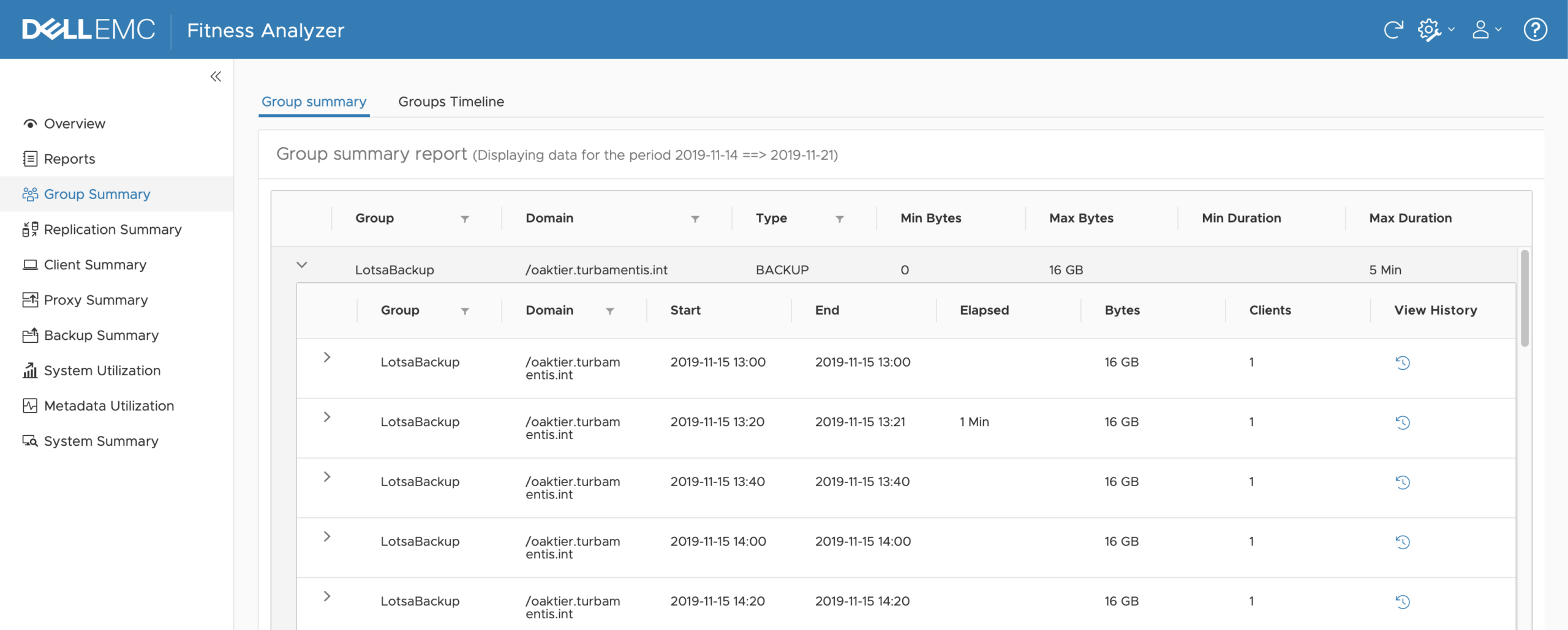
You can expand even further, giving you details of each client in the group in each run.
In addition to the summary views, there are timeline views, as well. The timeline view gives you insight into how the operations run during the course of each day – for instance:
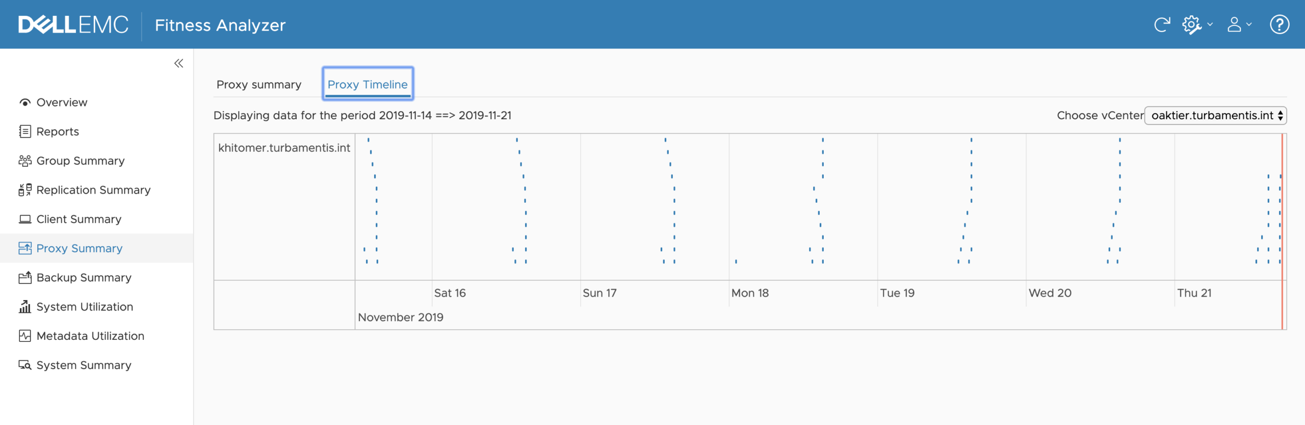
I’ve found that doing a sideways scroll while hovering over the graph portion of the display will expand or contract the timeline – again, great for tracking patterns in usage within your environment and seeing any abnormalities that may occur.
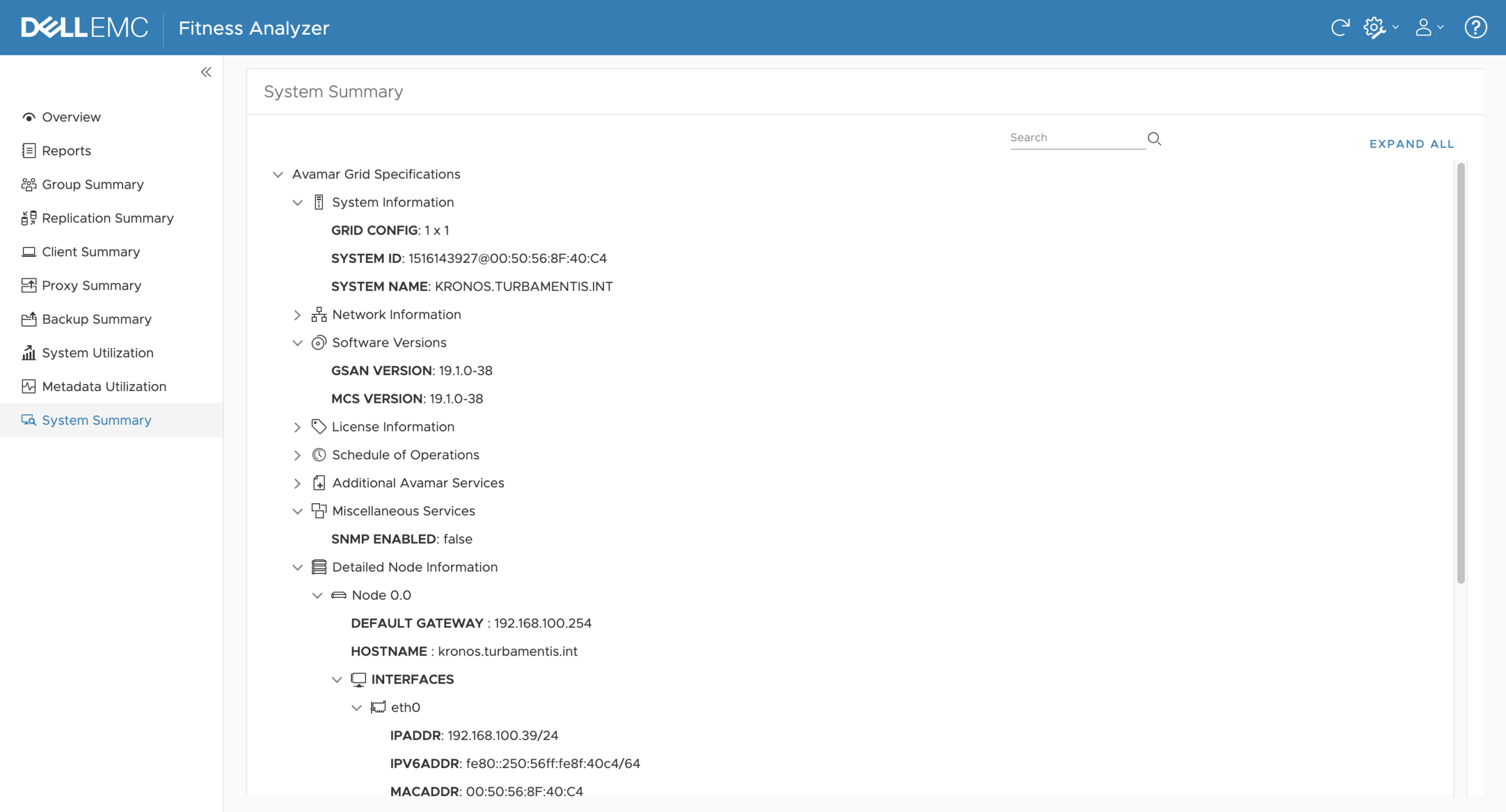
The final thing I’ll touch on for this article is the System Summary. The first time you click on this, you’ll be prompted to log onto the Avamar system (either utility node for a grid, or standalone node), become root and run a script. Handily, the Fitness Analyzer will offer to copy the script details to your clipboard to make it a painless process. After which, the System Summary will let you see all sorts of additional details about the Avamar hardware and setup. For example:
So there you have it – that’s the Avamar Fitness Analyzer. There’s such a wealth of information available in it that I think it’ll profoundly change the way administrators review their Avamar data protection environment.